Today, any organization (no matter the budget) deserves and can afford clean graphics. I’ve come across too many firms that struggle to produce a high quality image when prompted. The fact remains—if you are spending money on print ads with outdated graphics, you are throwing money away. The market is saturated with polished brand elements, and you don’t want to look like you’re not doing so well. Even if you like the look of your logo, an update can come as easily as turning your tiny image of a scanned business card into something that can be read on that billboard you’re paying hundreds or thousands of dollars for. And even if you have one logo, you might be lacking treatments for different situations.

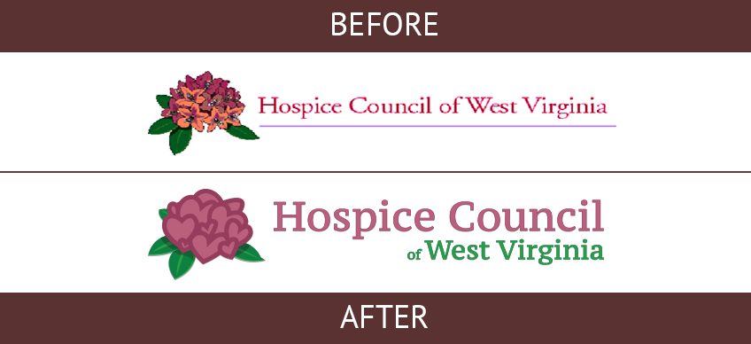
It’s hard to say how long it has been since the Hospice Council of West Virginia had been without a consistent brand image. After all, they are a non-profit organization with a mission focusing on what is most important. But I would stress (if nothing else) an established brand saves time and allows for more focus on the message. When updating the look, I aimed to maintain as much integrity of the old logos as possible while bringing a new simplicity that would not distract from their message. I changed the font face and size to bring full value to any occupied space. I also successfully incorporated hearts—the universal symbol of love, care, and health. The new logo was beautifully integrated in their web 2.0 website as well as their other materials.

